What makes
a good museum?

2024 - IED Summer project:
Redesign of
L’Antropologico
As part of a summer course at IED in Florence, I joined an international team to redesign the Museum of Anthropology (L’Antropologico), a hidden gem filled with rare cultural artifacts — but presented in a way that felt outdated and disconnected. Our goal was to make the museum more engaging, accessible, and relevant to a wider audience.
Coming from a background in UX, I initially struggled to find my footing among the graphic design students, who spoke a very different design language. But through open collaboration and a lot of listening, I found ways to bridge our perspectives — and learned a lot about visual communication and compromise in the process.
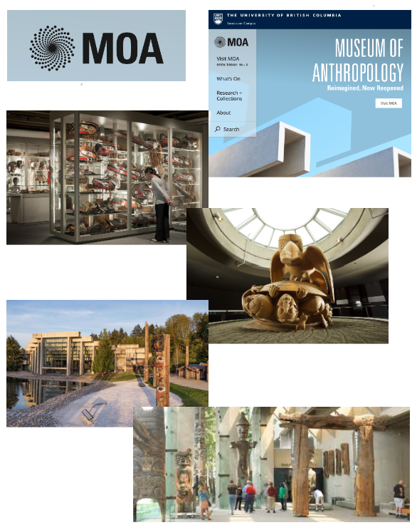
Want to skip to the good part? View the final results here→
-
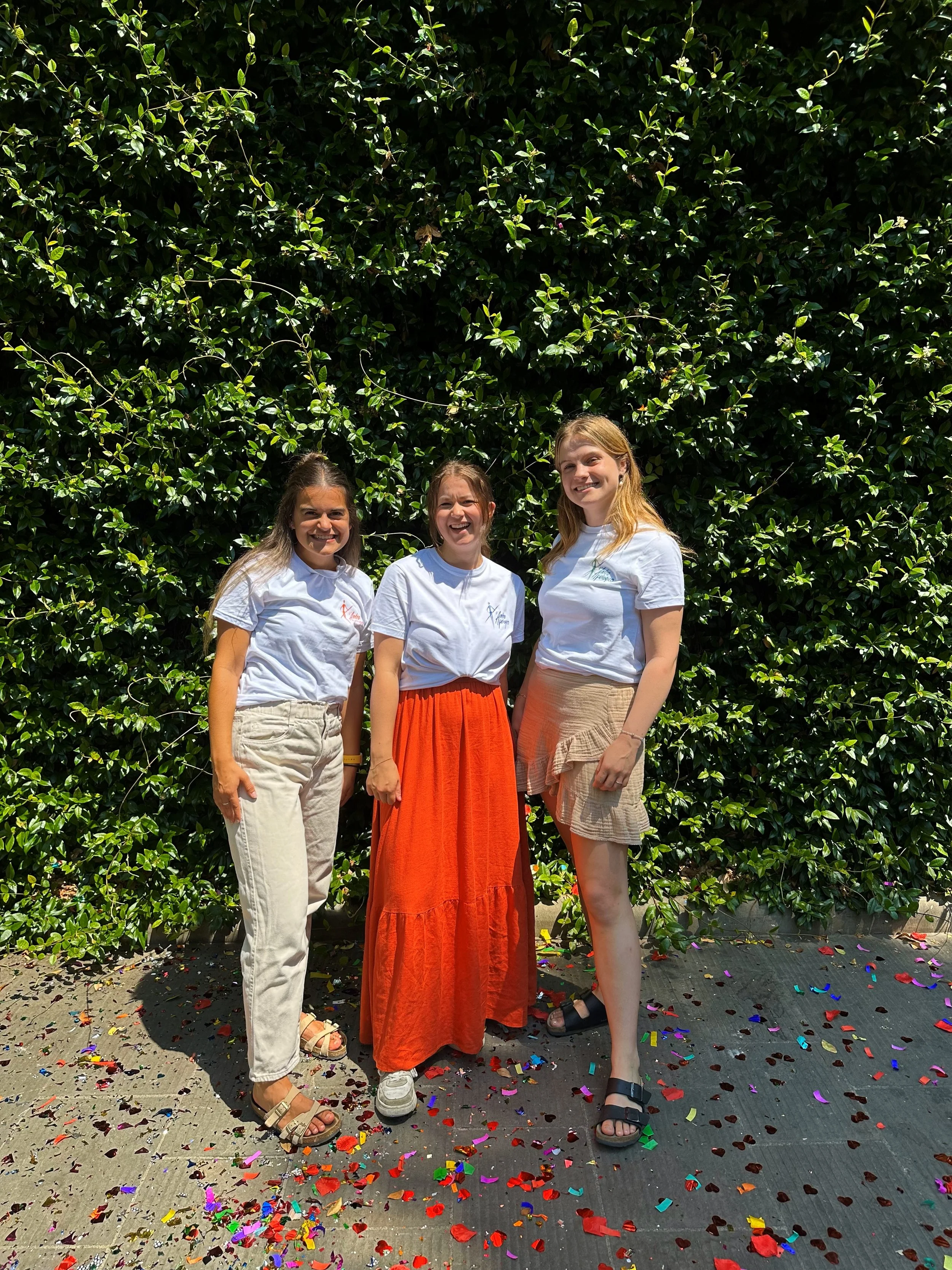
I worked in a group with two other students (From Sweden and the USA). As the others, I did all aspects of the redesign process: Layout, Colors, Typography and more.
-
Graphic Design, Typography, Layout, Colors, Theming, Project planning, Museum research, Group work, Photoshop, Indesign, Illustrator
-
IED (Istituto Europeo di Design)
July 2024 - Florence, Italy


Lessons learned 💭
This experience taught me a lot about interdisciplinary collaboration and the importance of being open to different processes and perspectives.
In the beginning, it was challenging to work with graphic design students who had a strong visual language and a different focus than what I was used to from UX. I felt a bit out of place, and it took time to find my role in the group.
One thing that didn’t go so well was how we initially disagreed alot — we had different expectations around both the process and the outcome. But as we learned to communicate better and recognize each other’s strengths, the collaboration started to flow.
What worked well was that we eventually managed to blend visual storytelling with user-centered thinking, and created a concept we were all very proud of.

WHy redesign?
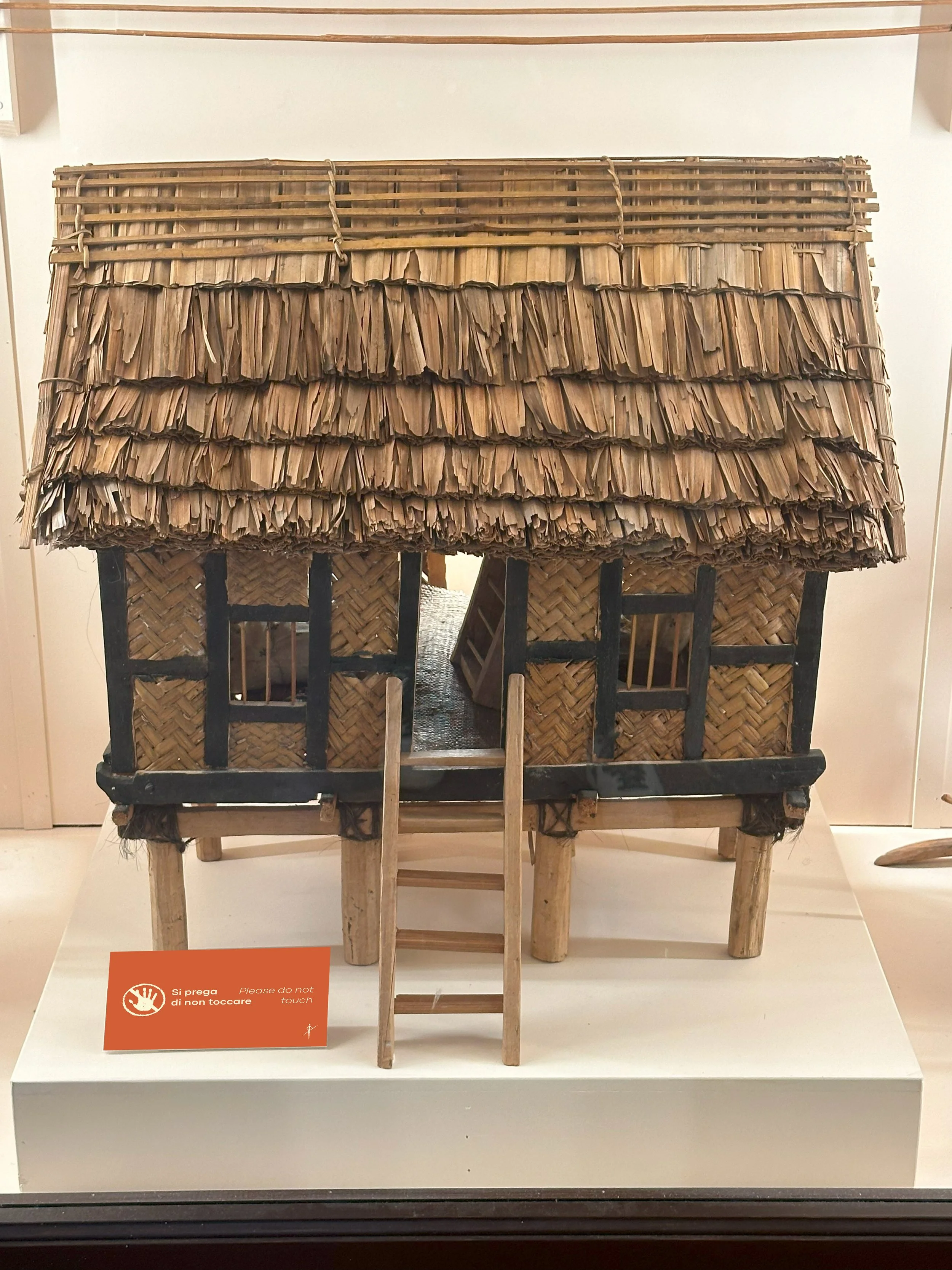
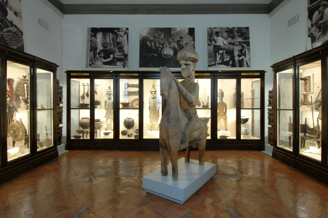
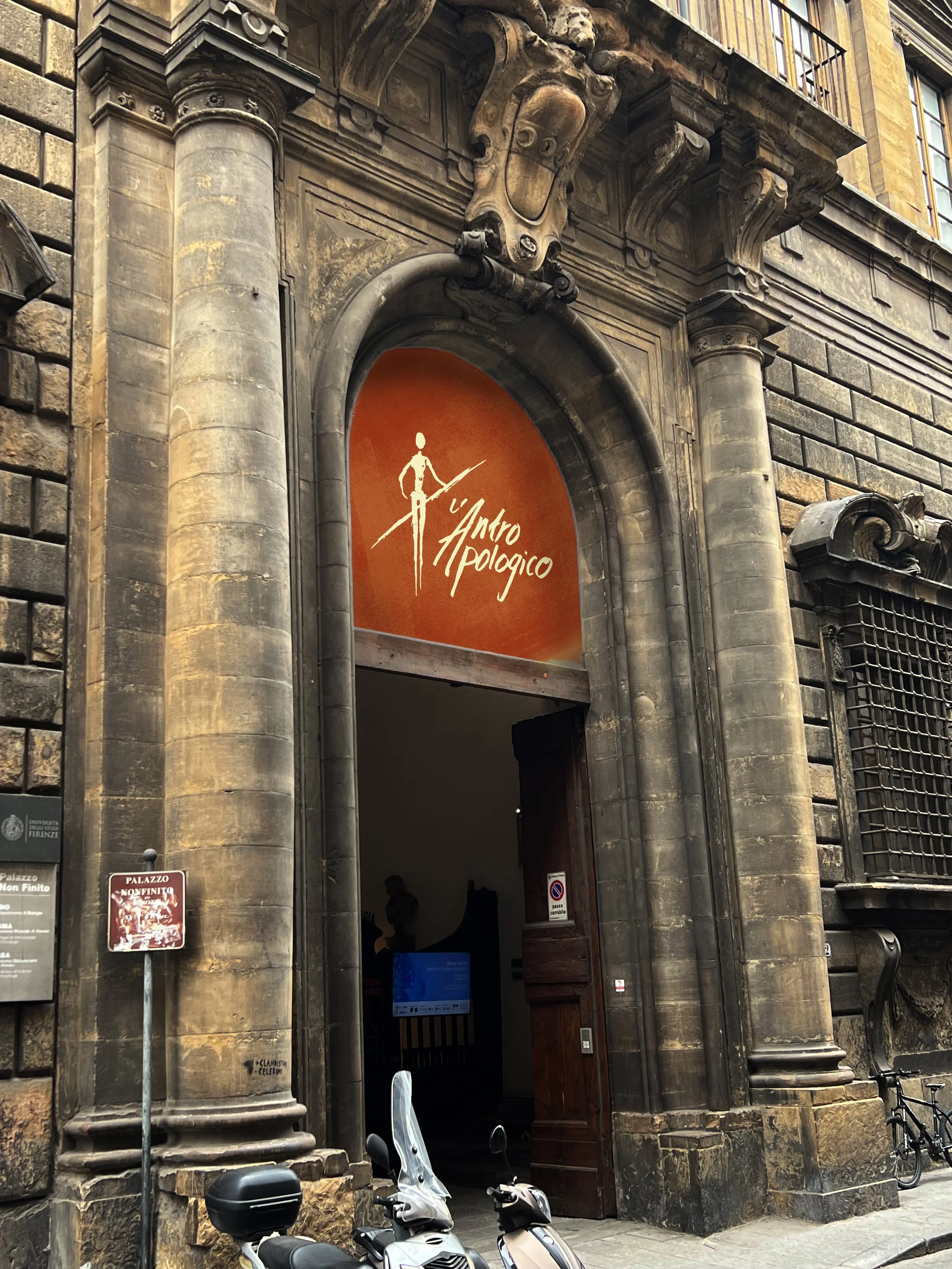
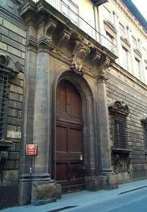
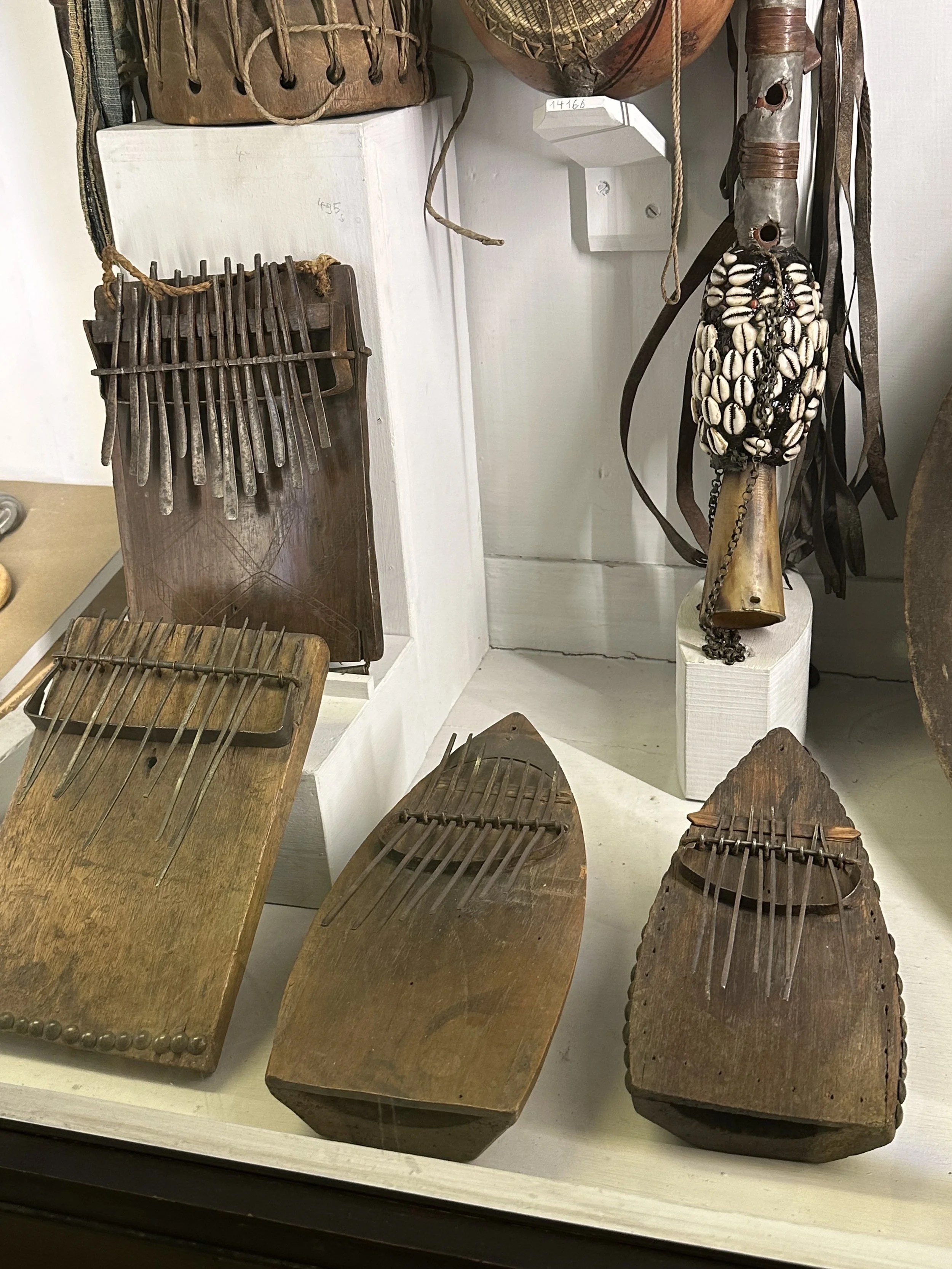
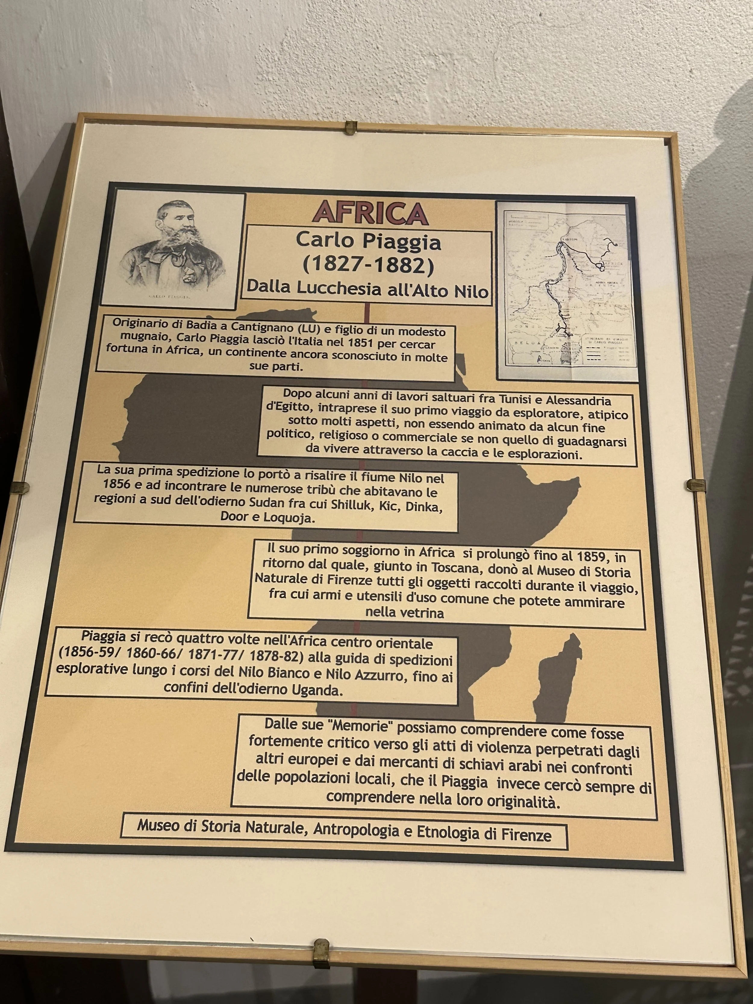
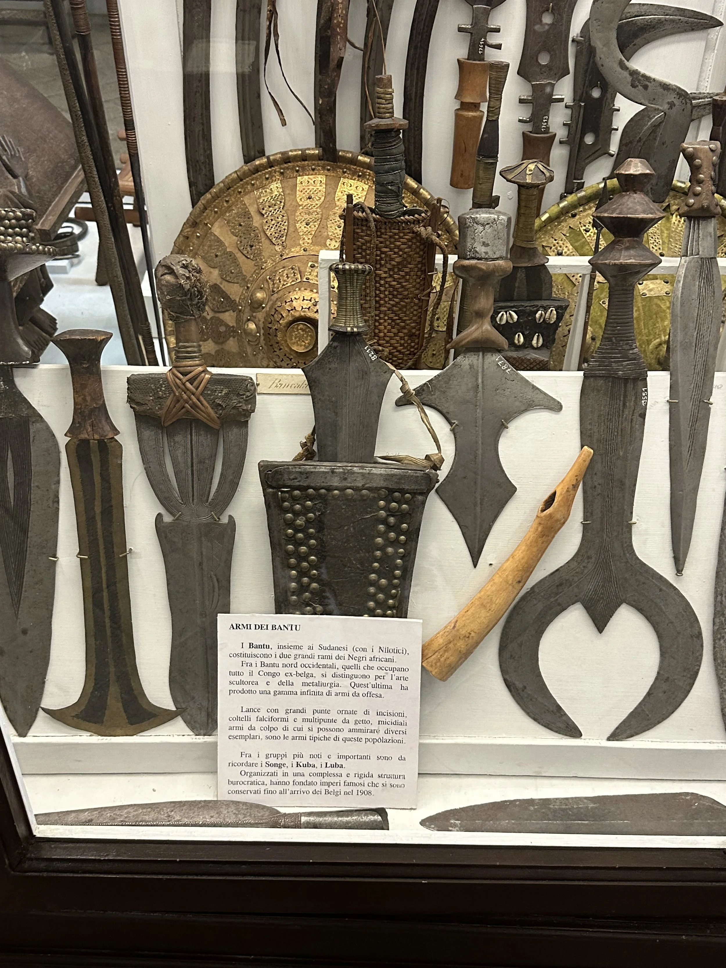
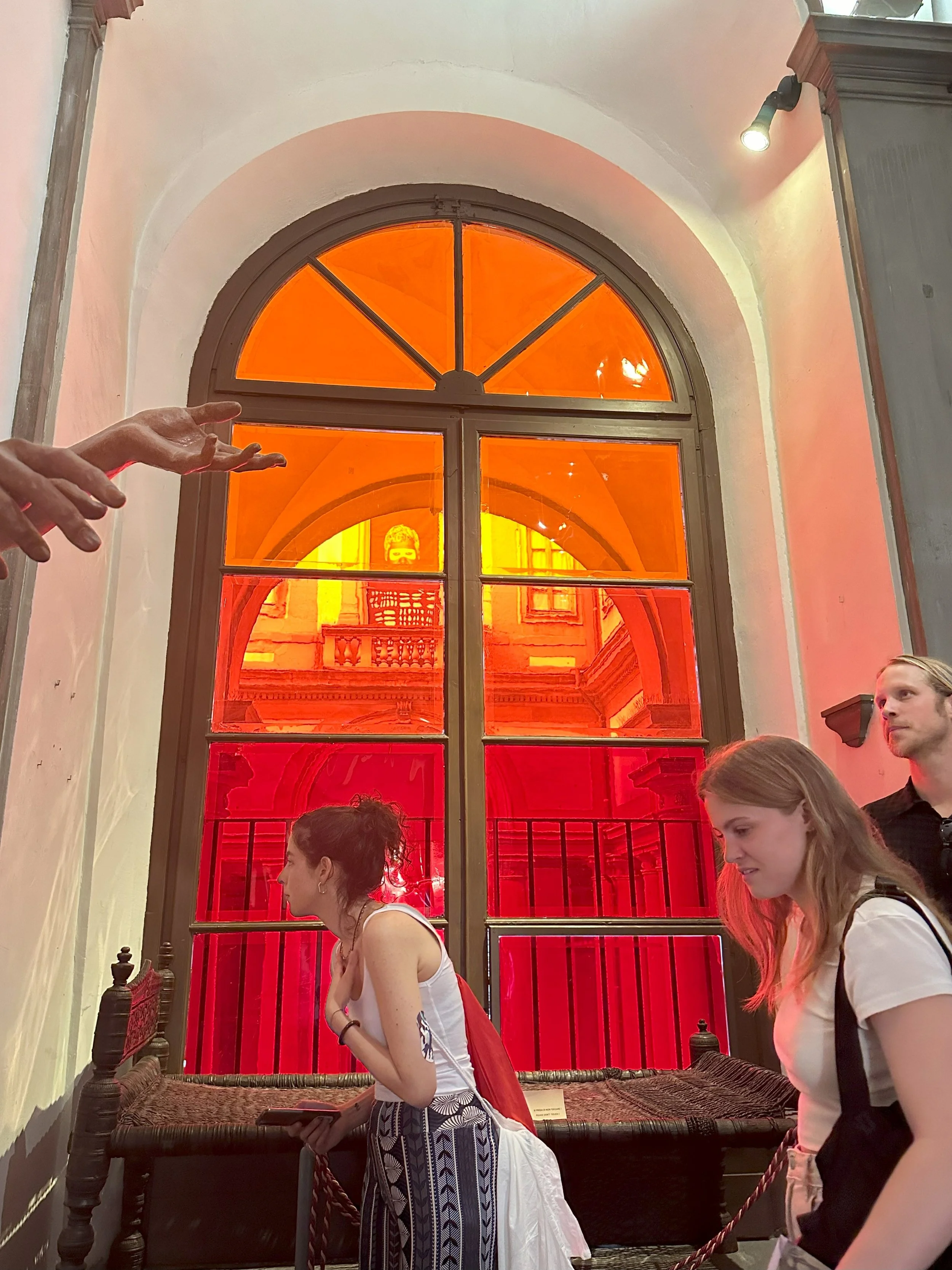
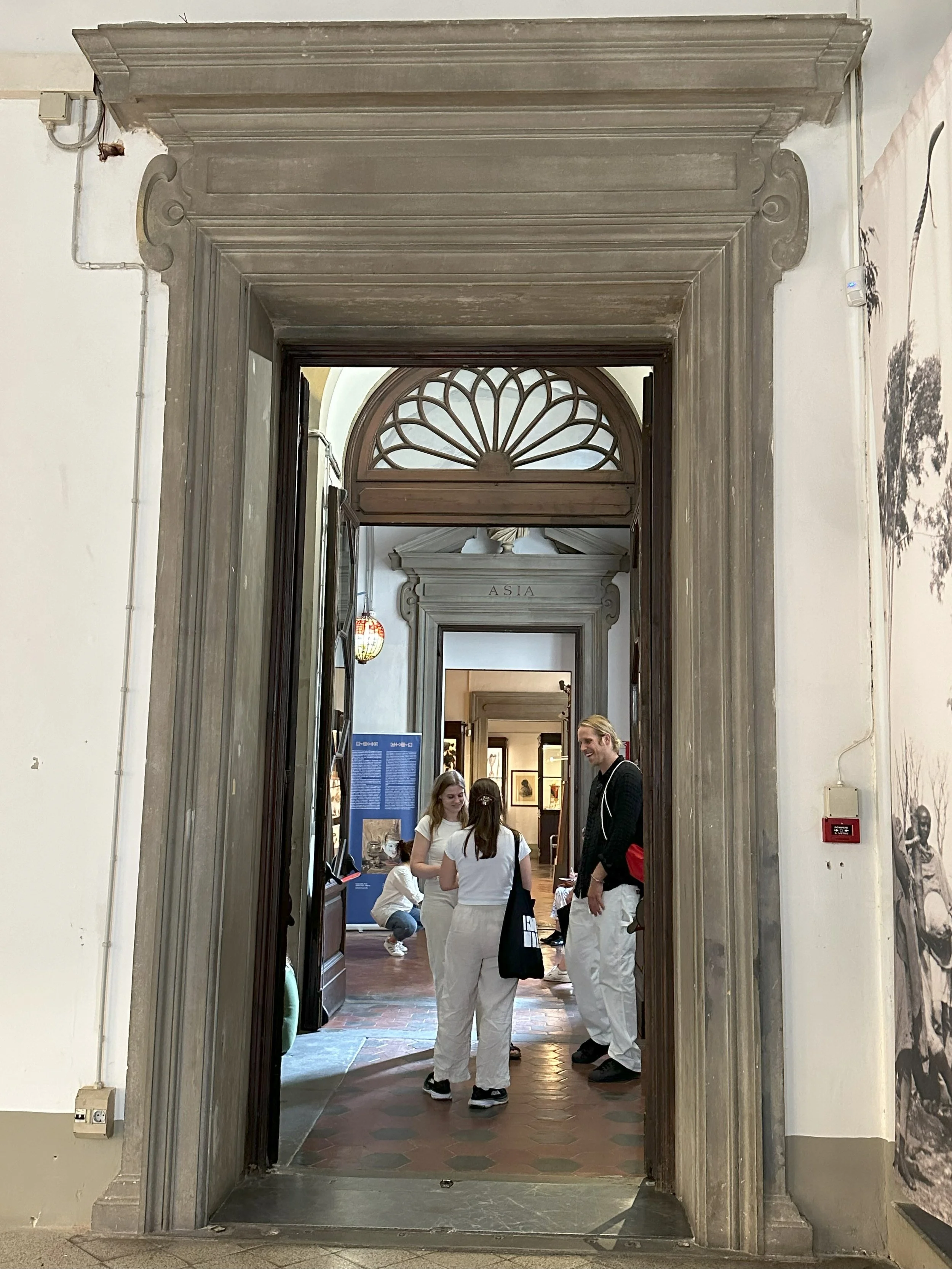
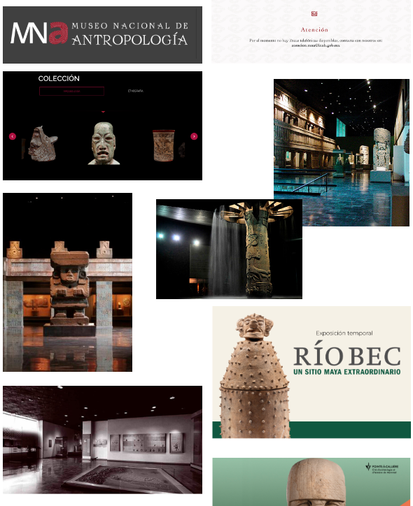
Museum of Anthropology (L’Antropologico) in Florence contains many exhibits concerning the different cultures and ways of humans across the globe. It had many rare artifacts from various tribes and people that were recieved (or stolen) from their original owner decades ago.
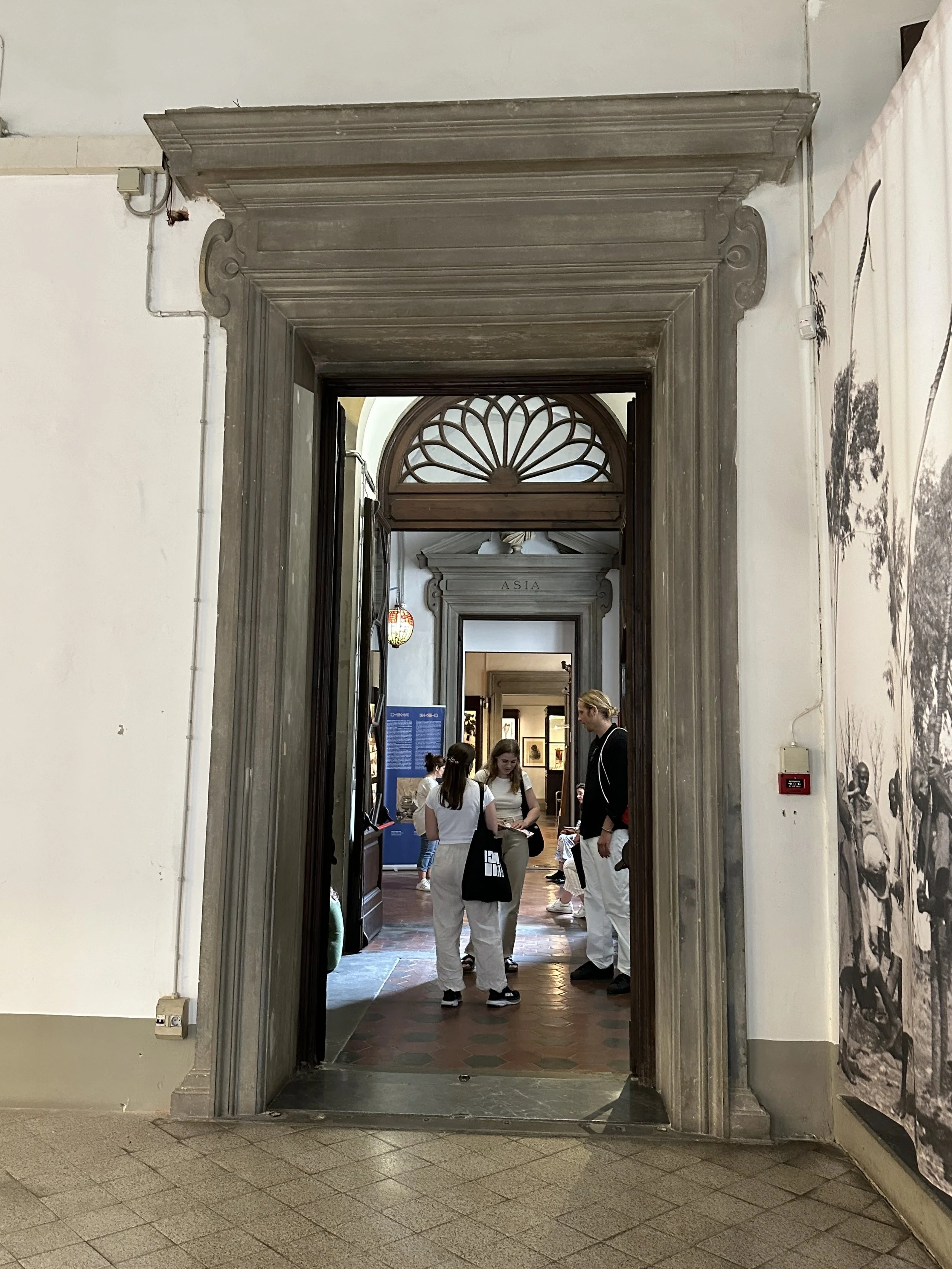
Over the summer, we visited the museum many times. It’s dark corridors, mismatched labels and 70’s era colors makes the museum feel outdated. Few people visit, even during peak tourist season. The lack of good descriptions or relatability to the average person made it hard to understand what the artifacts were and represented. When inside, we struggled to keep our interest.
We wanted to redesign the museum to help:
Attract more visitors
Engage visitors and keep them interested
Make it appeal to a broader audience
1) researching
To gather information on how to help the museum, we:
Learned museum design by lecturers at IED, such as materials, keeping engagement, wayfinding, universal design etc.
Visited the museum multiple times, and gathered data through photos, notes and observations
Talked to visitors and staff that were willing to answer some questions
Researched anthropology online, and the history of the museum
Looked at other museums in Firenze and other anthropology museums around the world to compare and contrast
Through this we gathered and collected key points we thought we could focus on in our redesign, as well as how we wanted the new image or profile of L’Antropologico to be.
2) Prototyping
After gathering our research we worked on prototyping and creating a new visual and vision for the museum by:
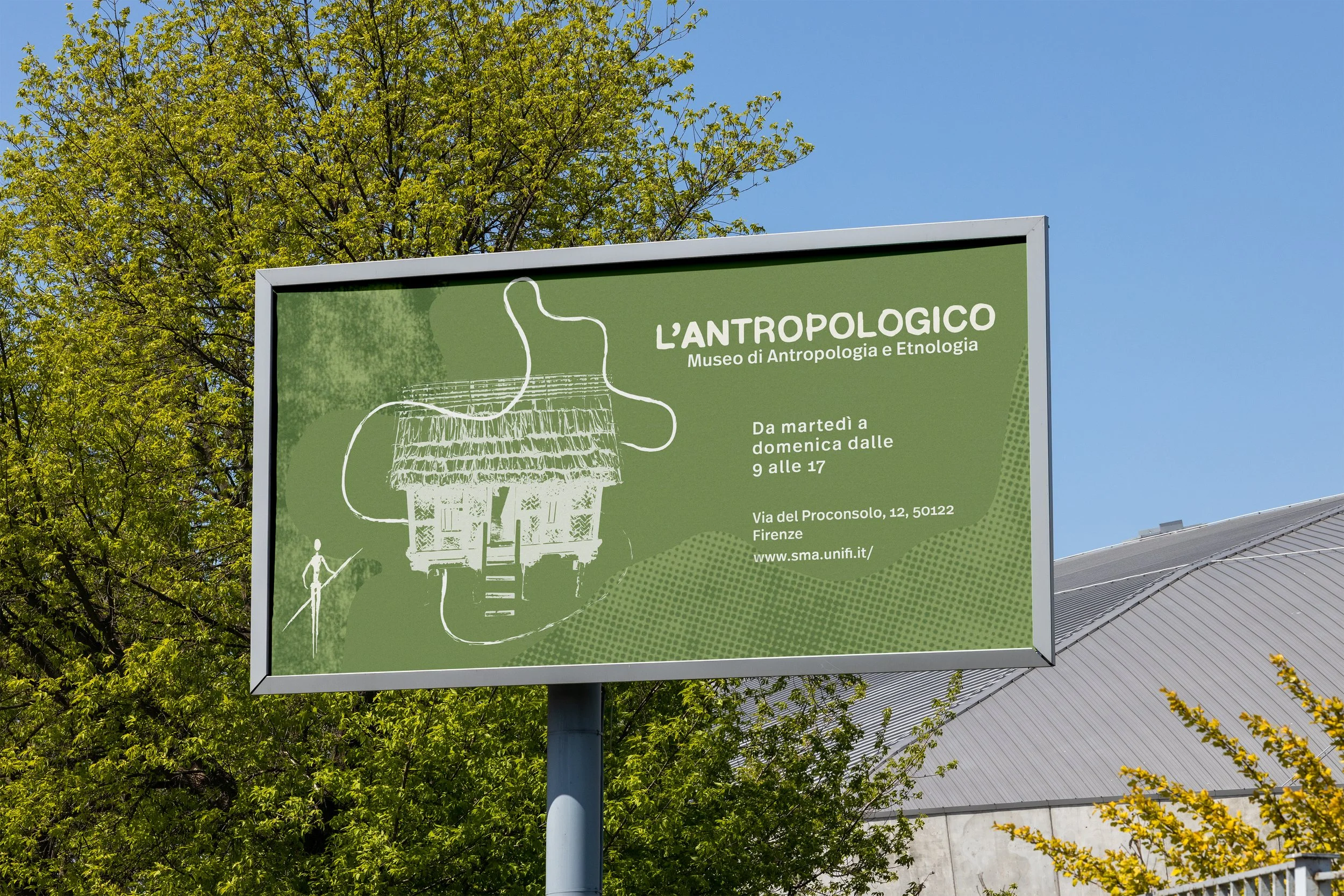
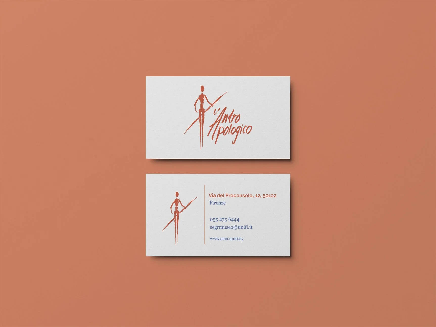
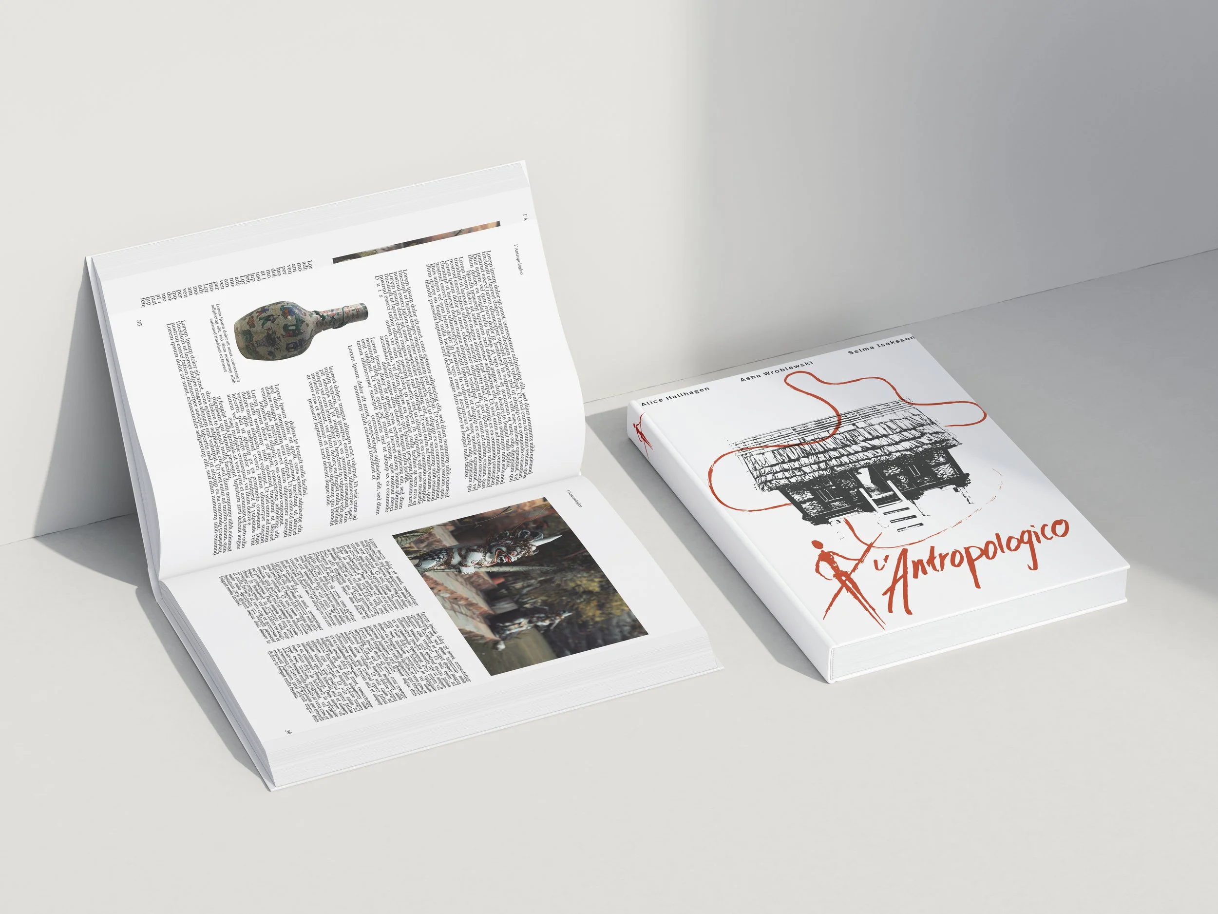
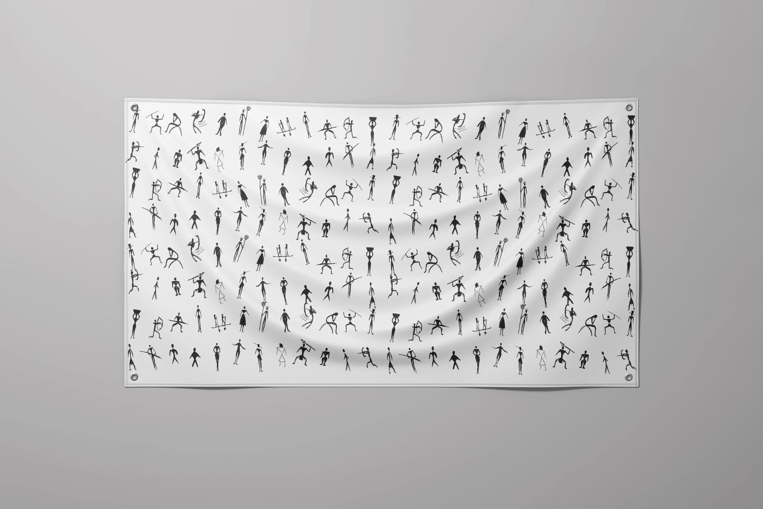
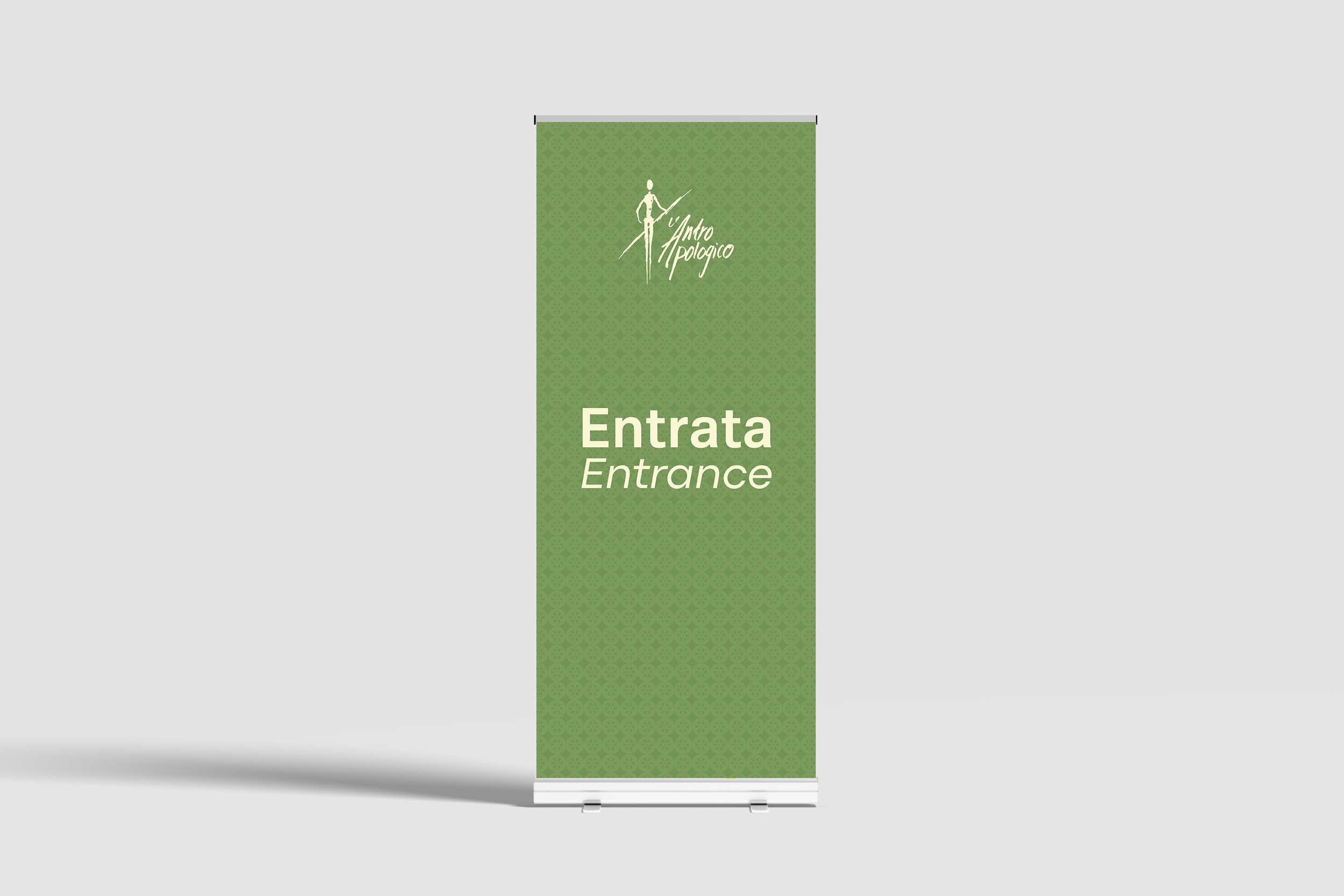
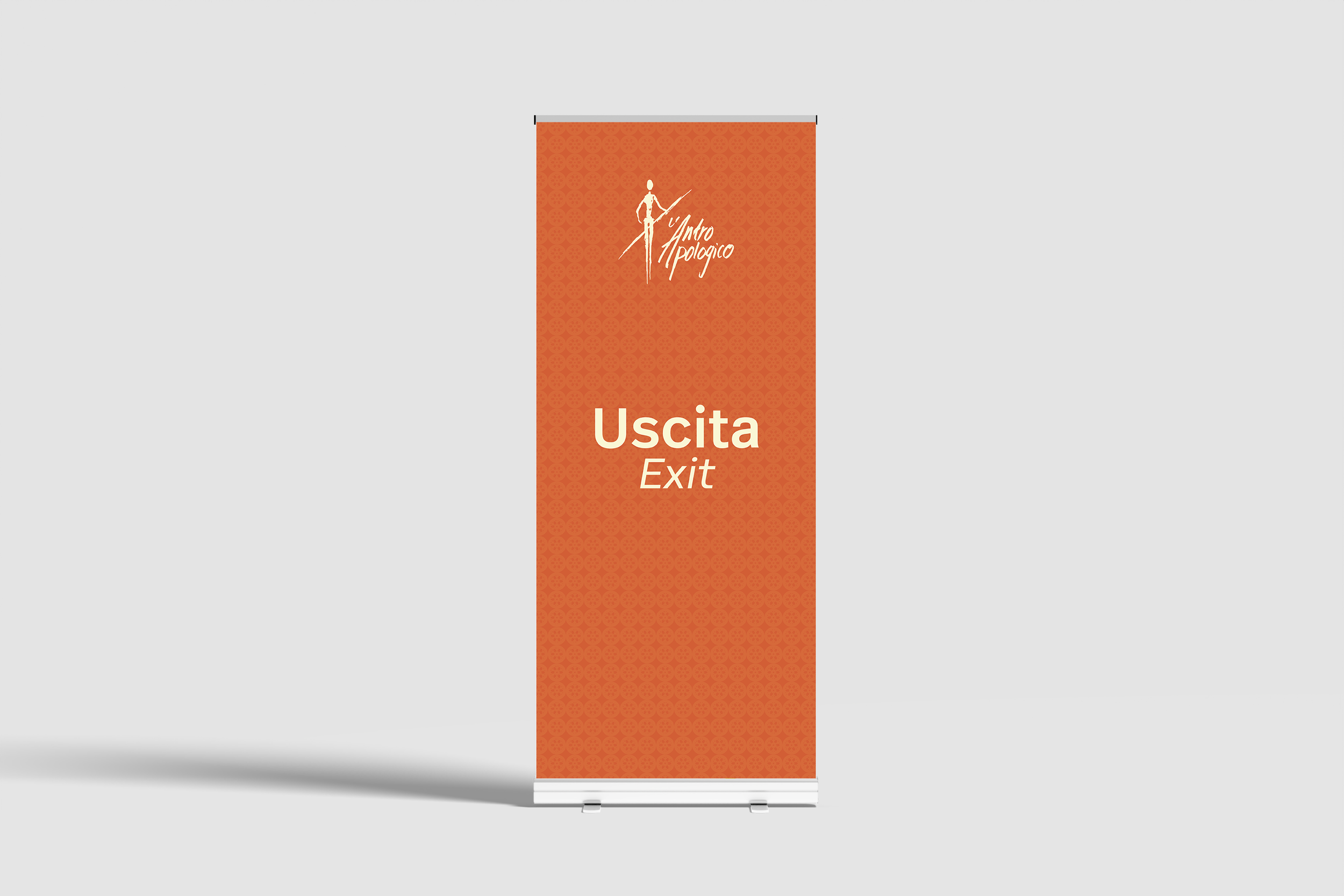
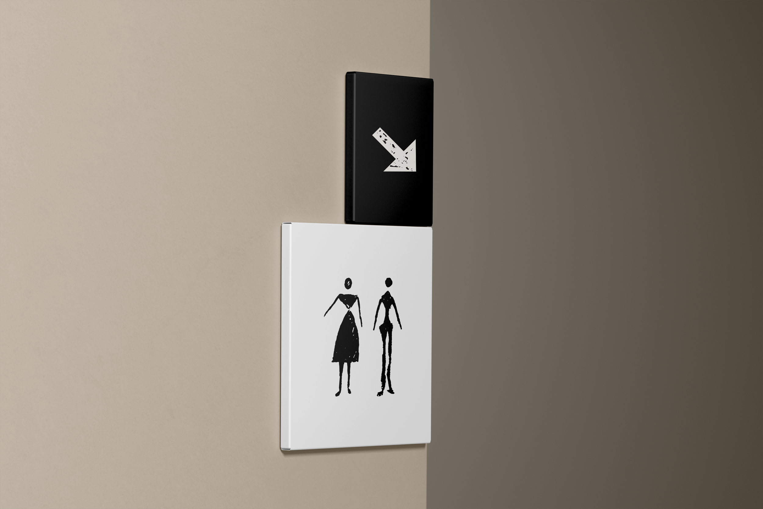
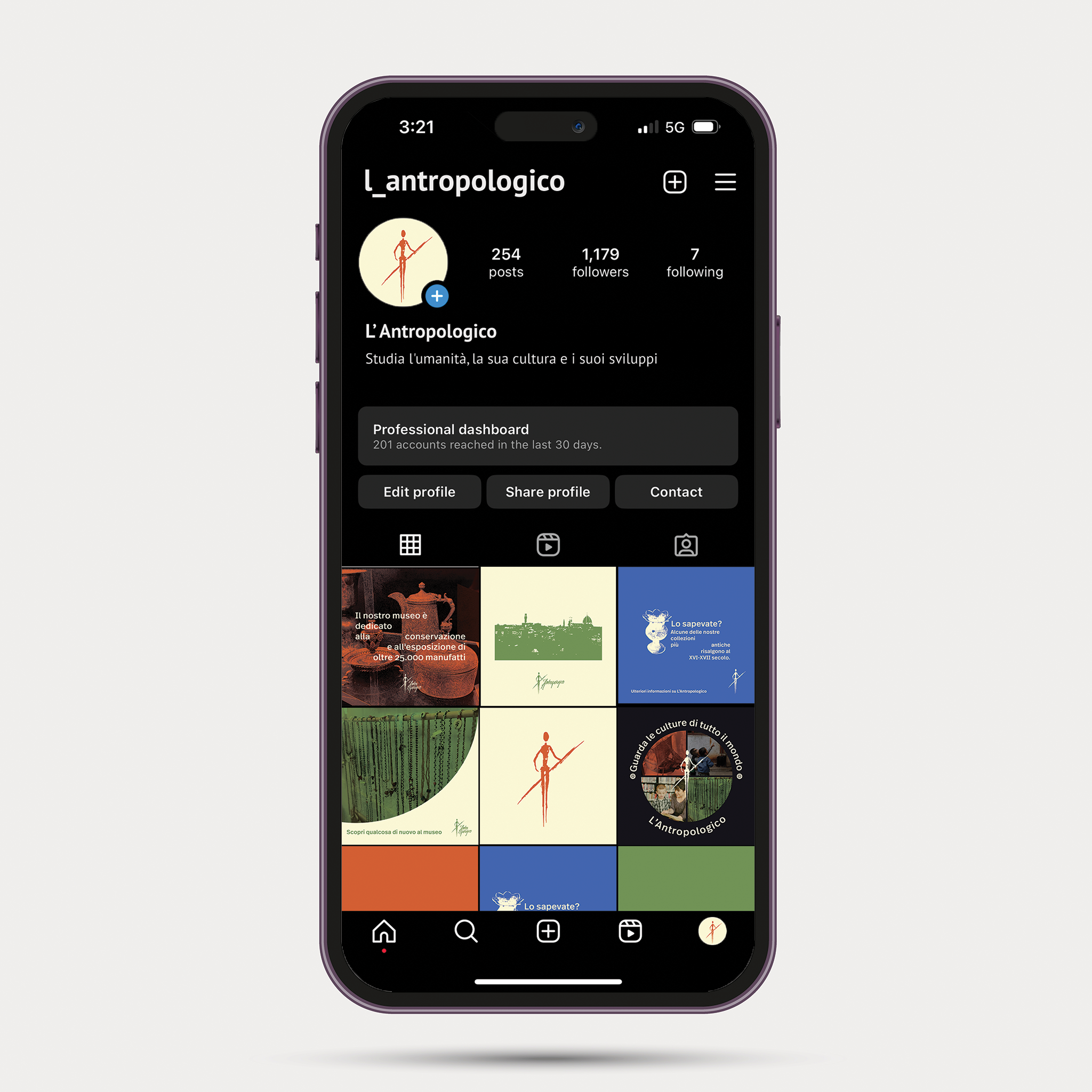
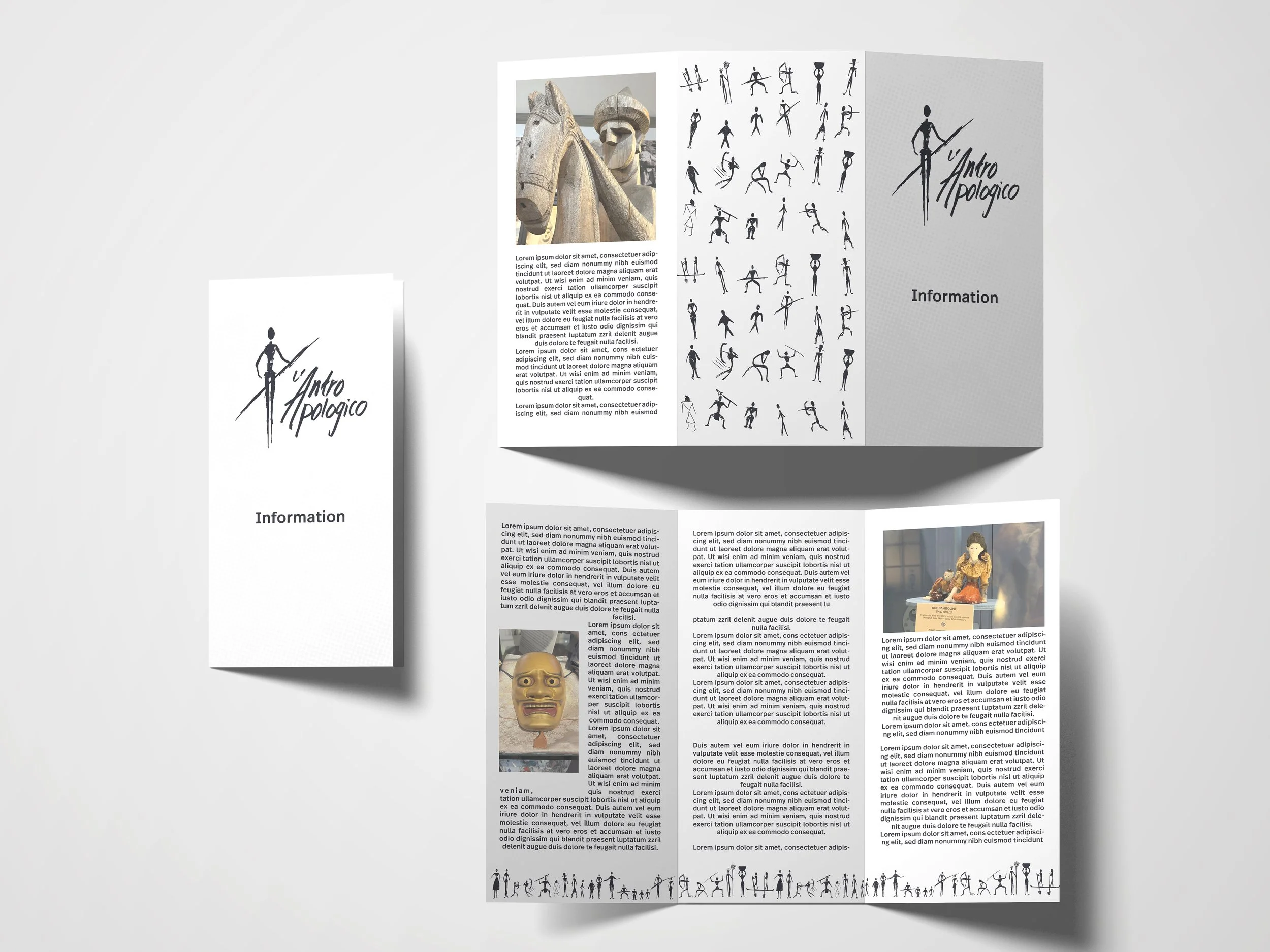
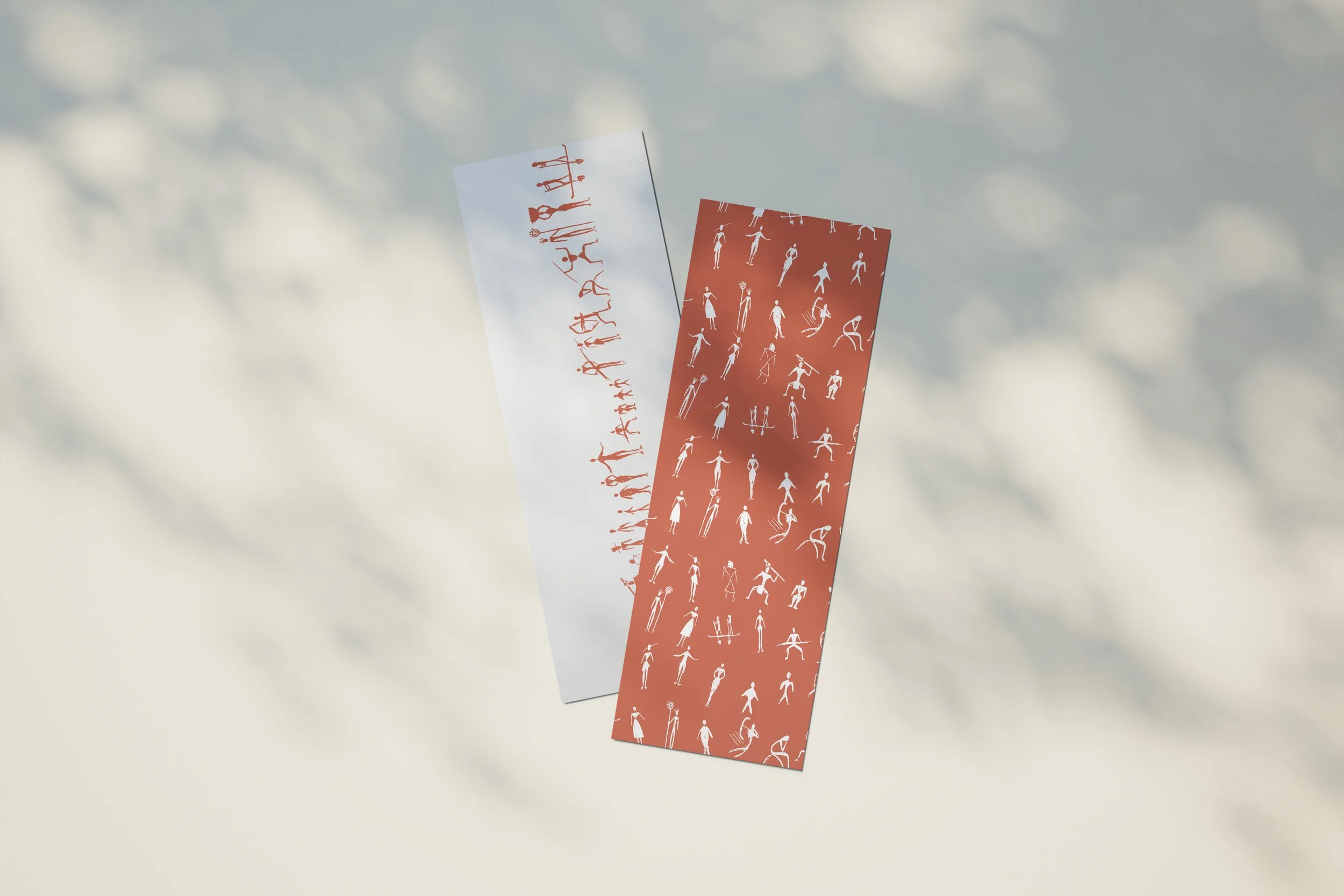
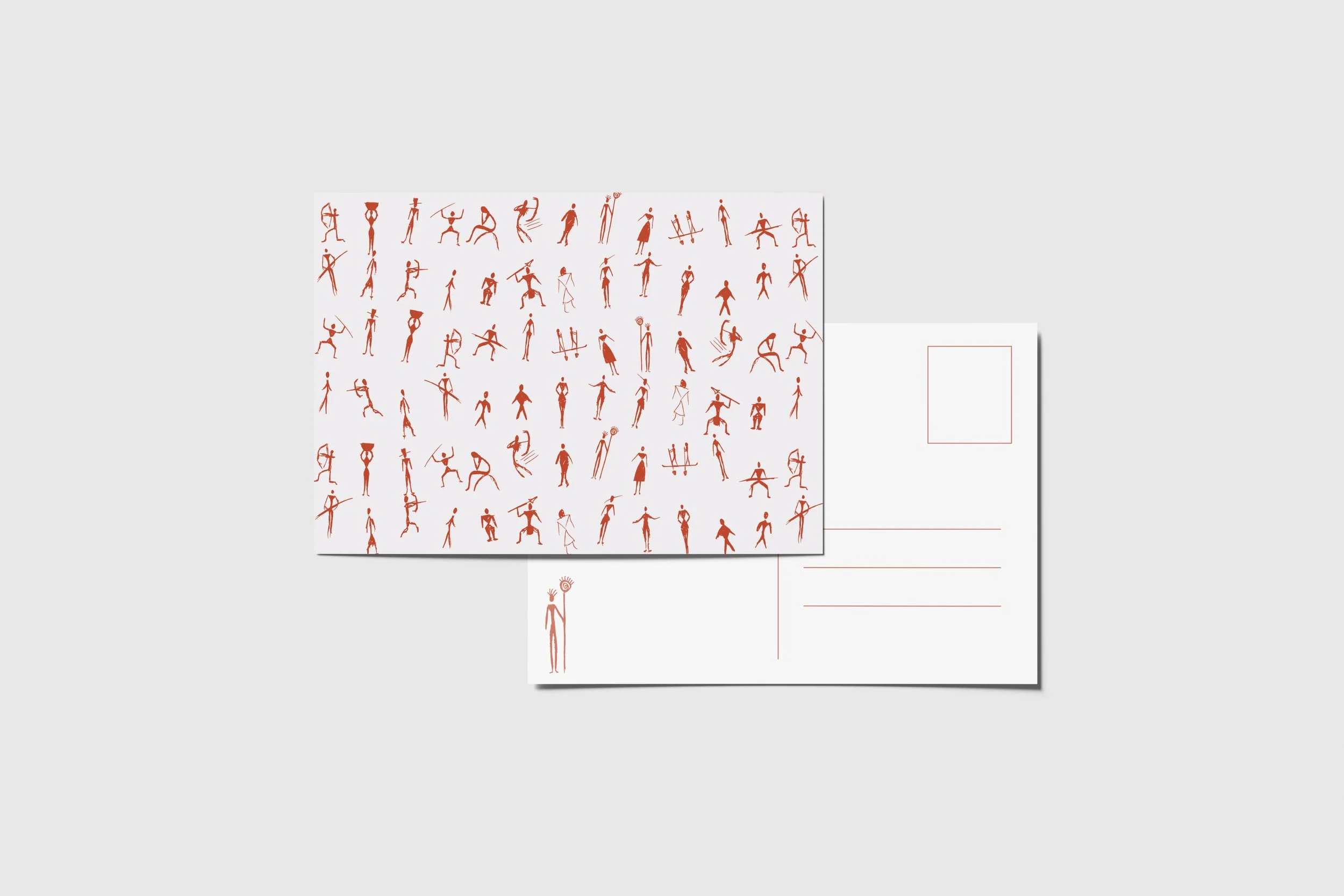
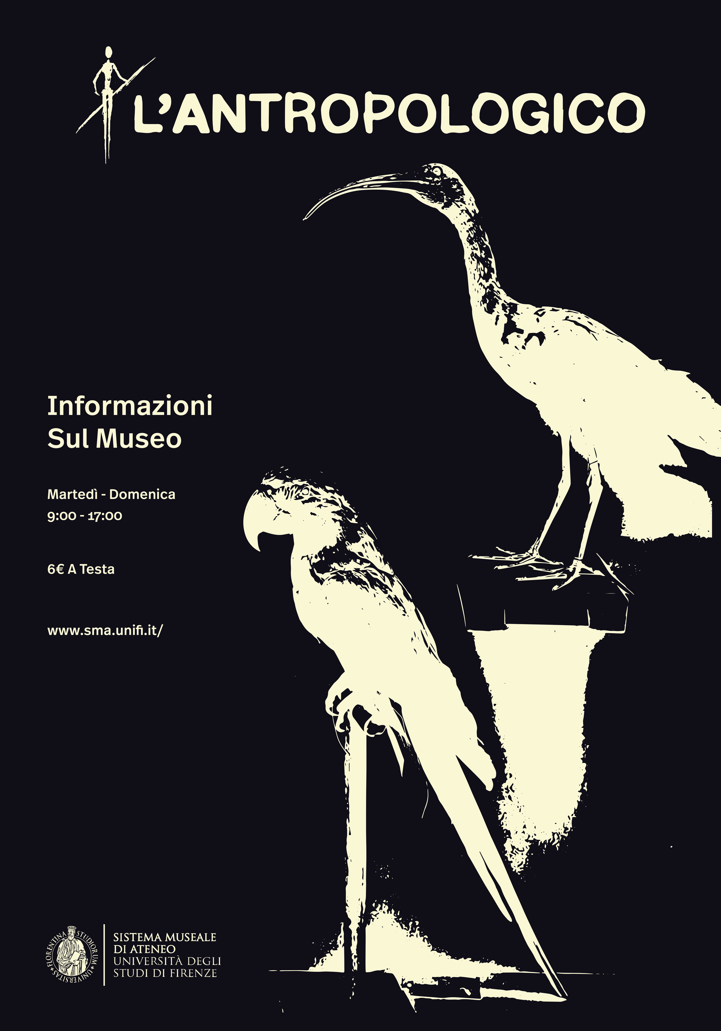
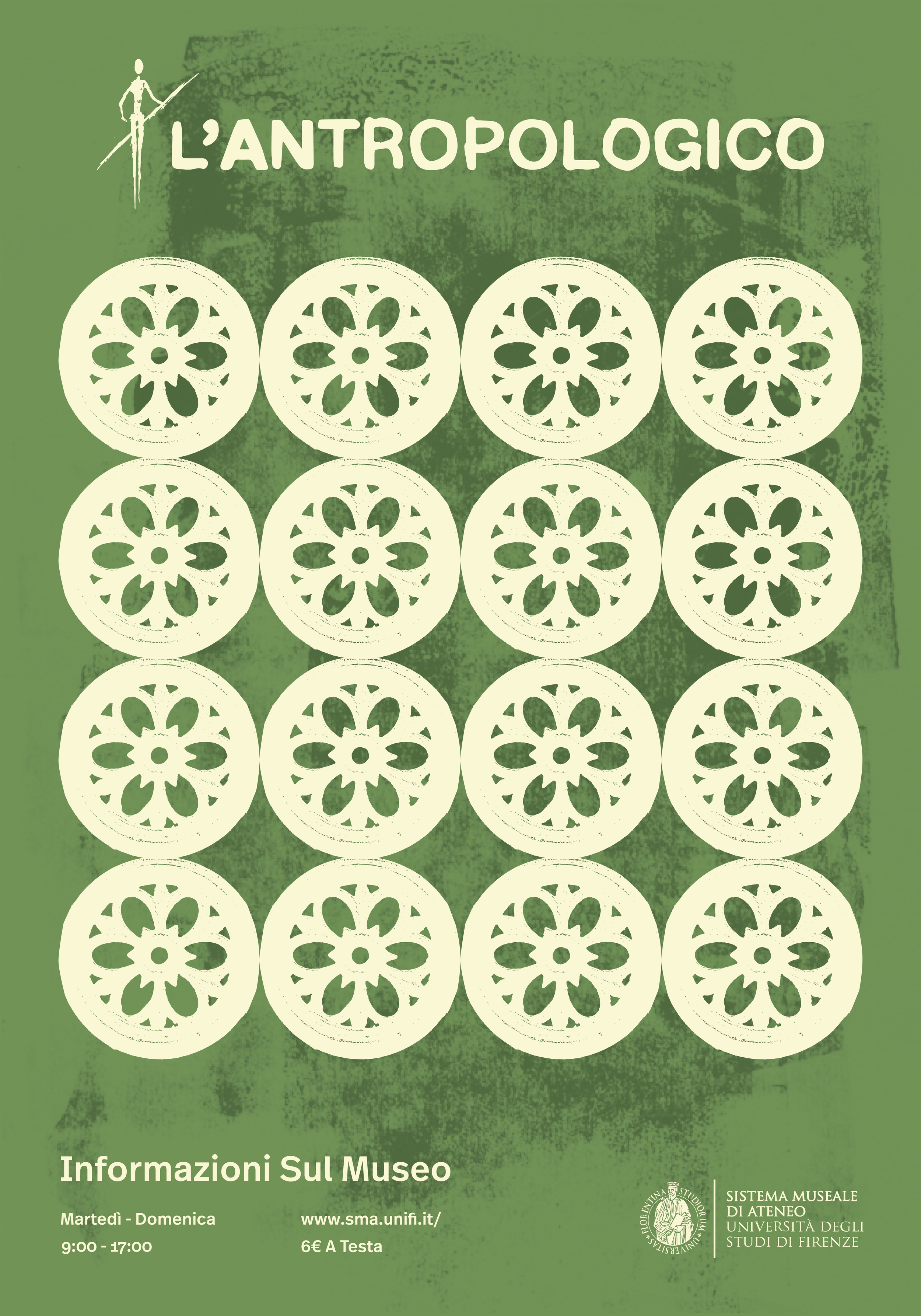
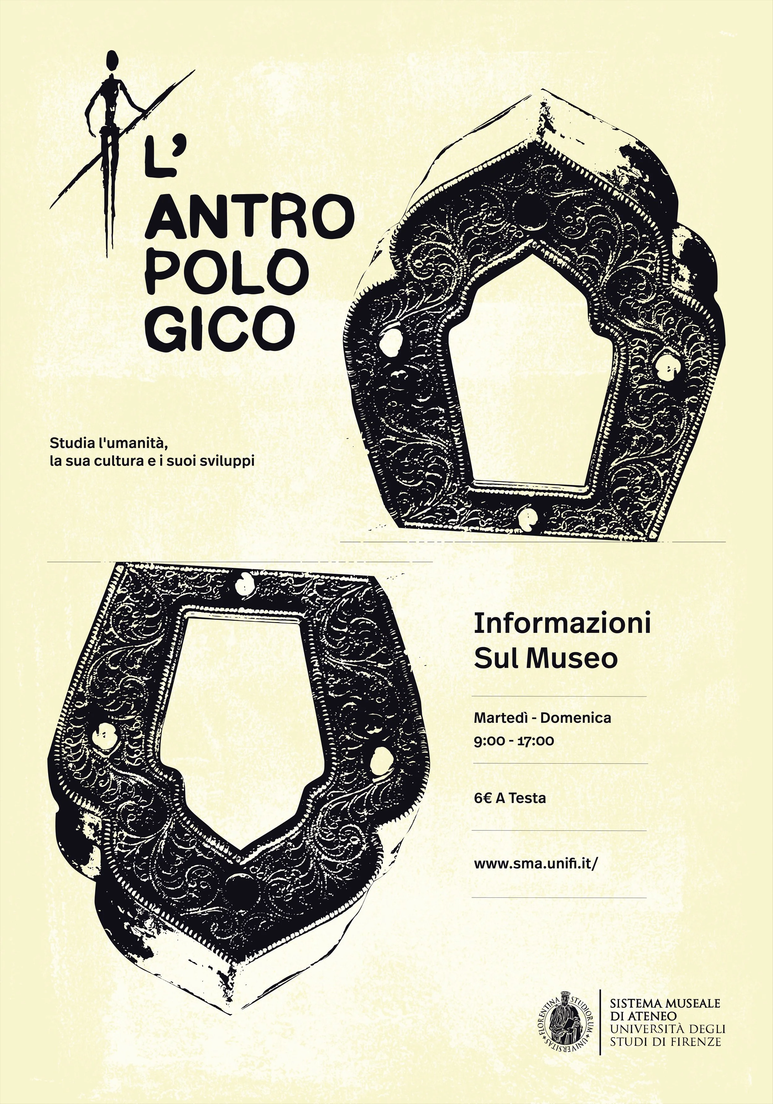
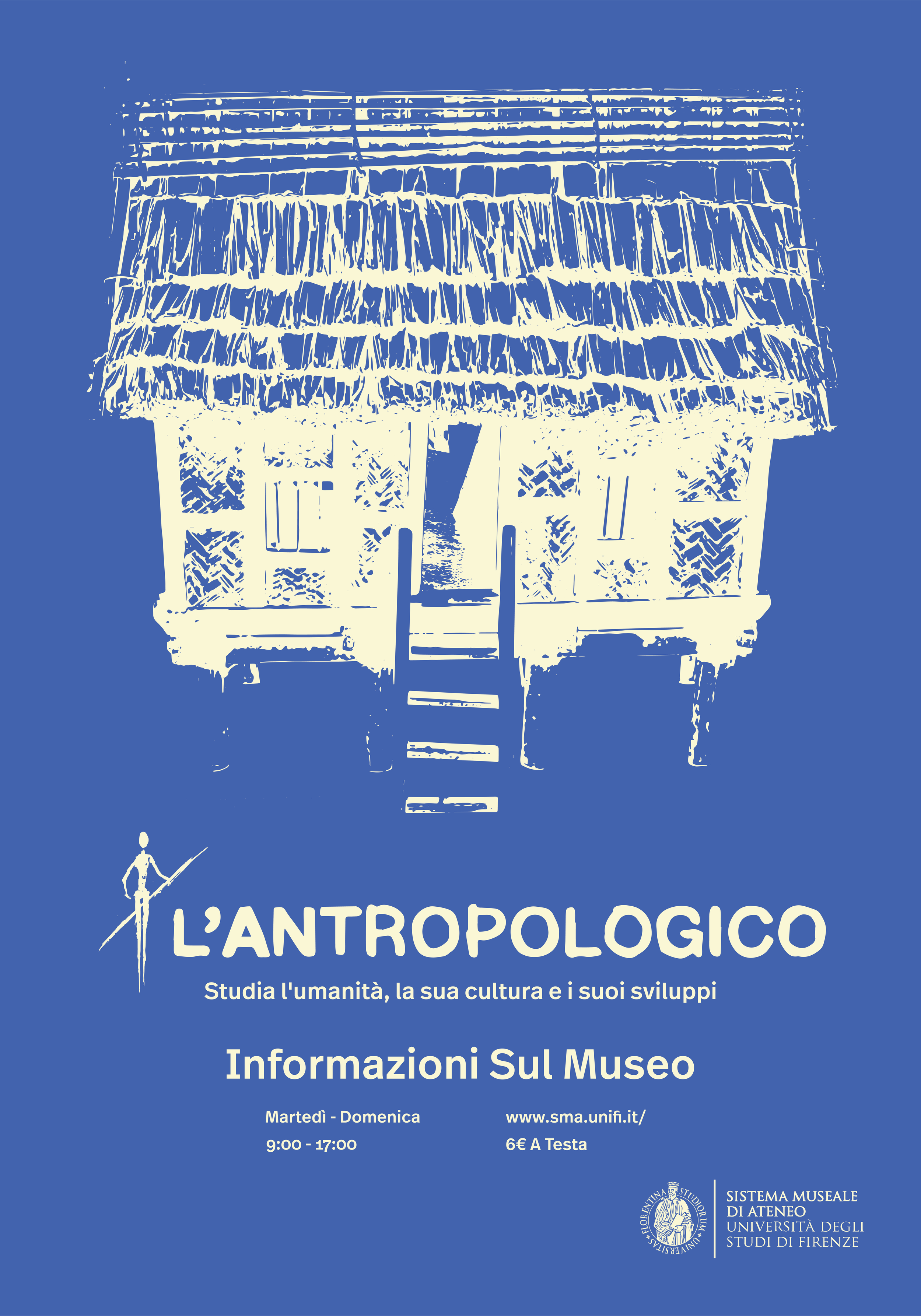
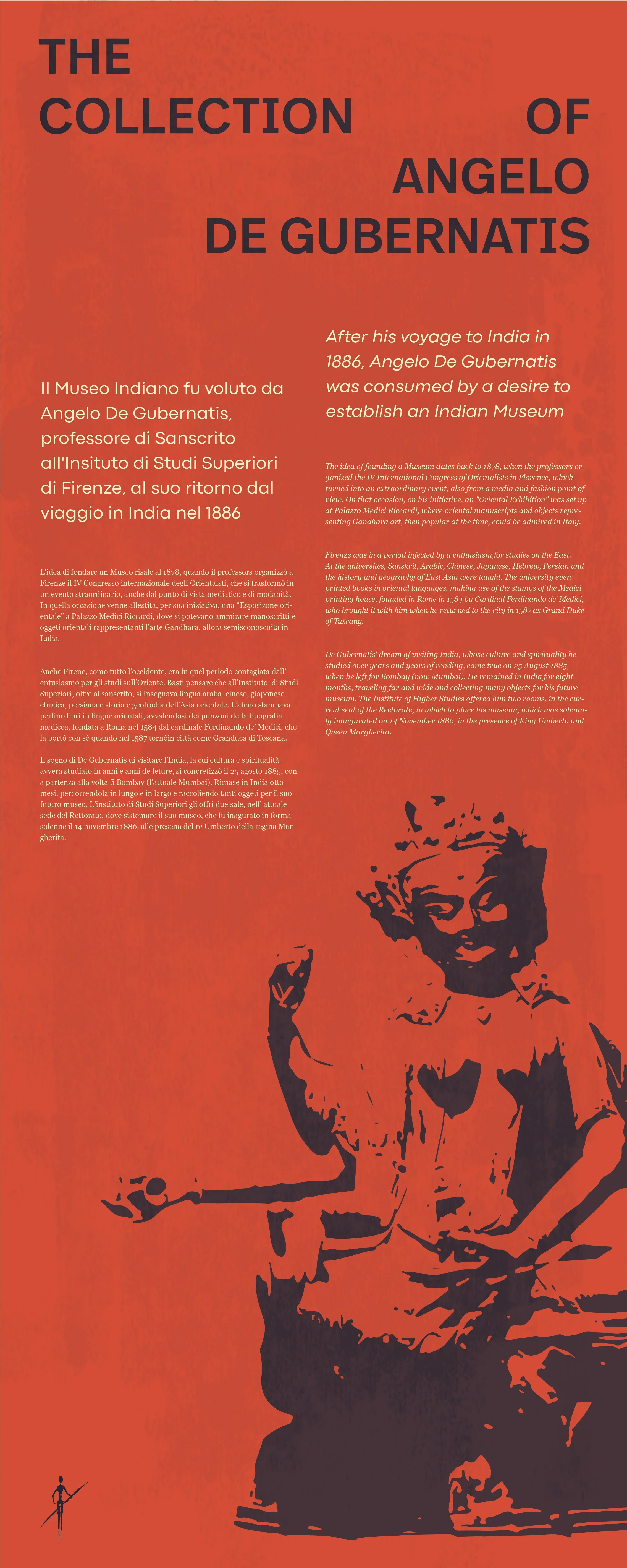
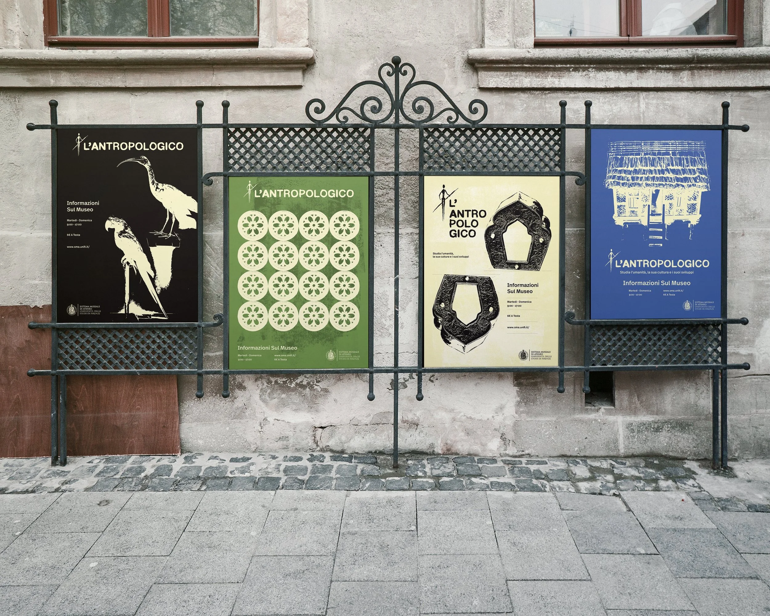
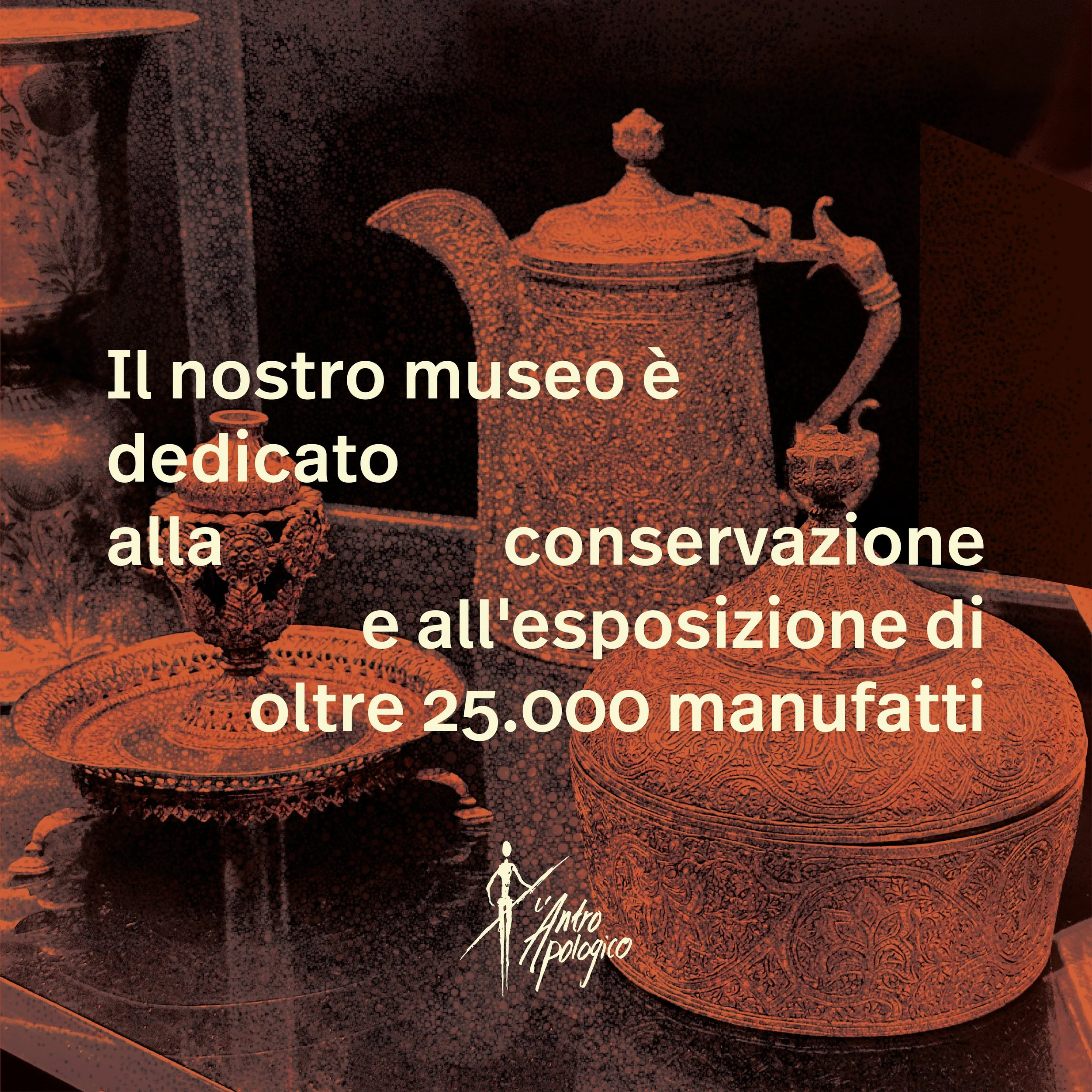
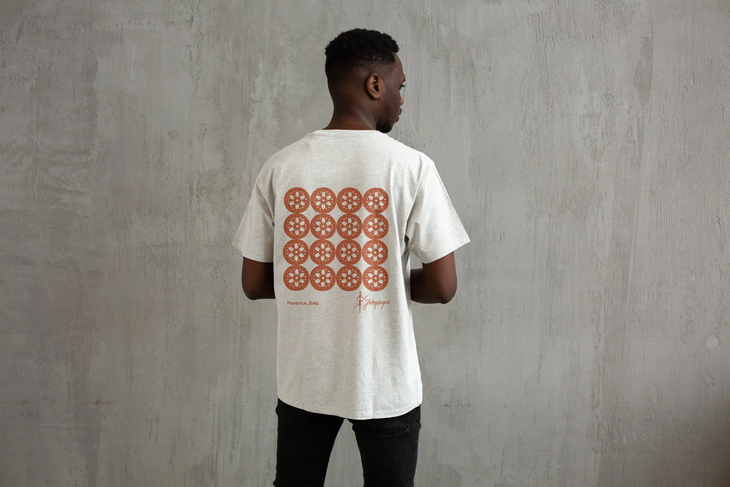
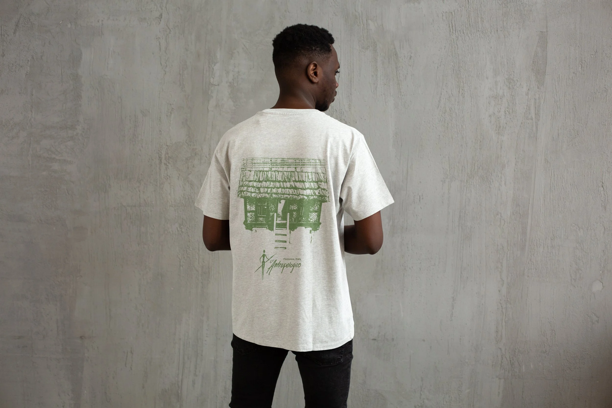
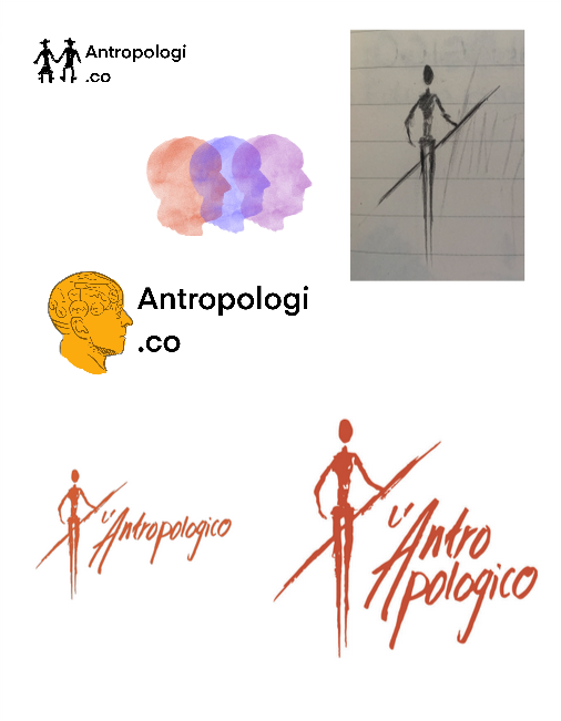
Creating a key visual that would be used as a recognizable and easy to use identificator for the museum
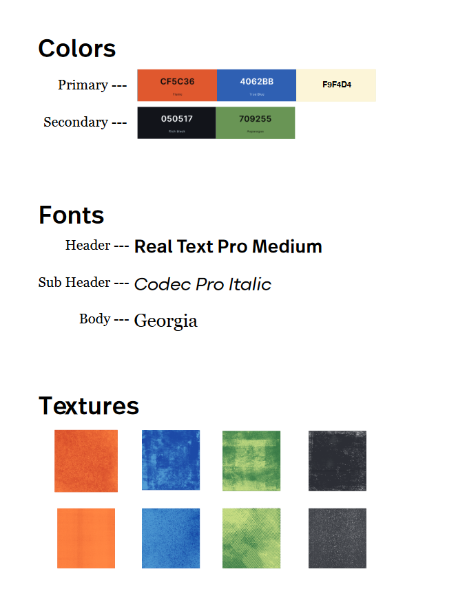
Drafting a style guide with fonts, materials and colors to be used throughout the redesign to help unify and stylize the museum
Making rough sketches of key elements such as posters, information signs and wayfinding elements
Through this we solidified the final plan for the project, and unified our vision as a group. This was key, as we would all work on diffrent elements on our own later in the process. Without a common vision, we would not have a thorough and unified redesign, where all elements fit together and have a common goal and theme.
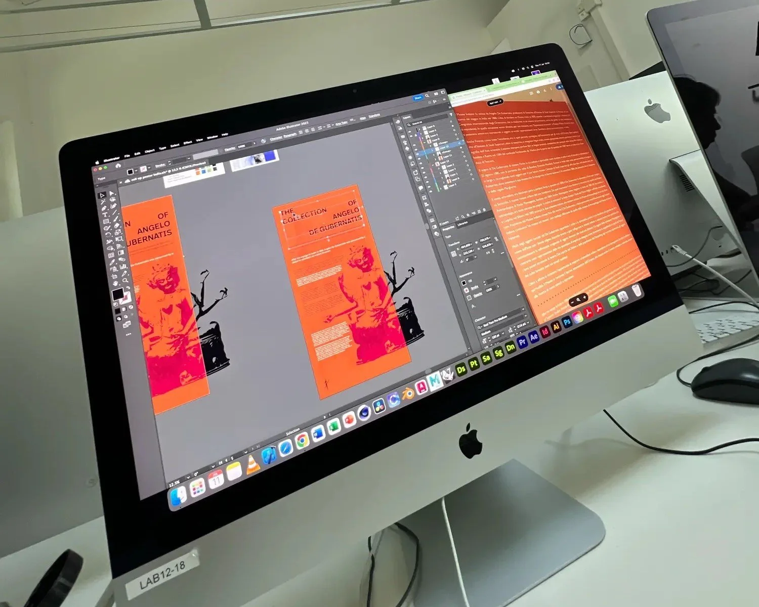
3) Creating
Using Adobe Photoshop, Lightroom and Indesign we created:
A new identity for the museum by uniting elements using our style guide and vision
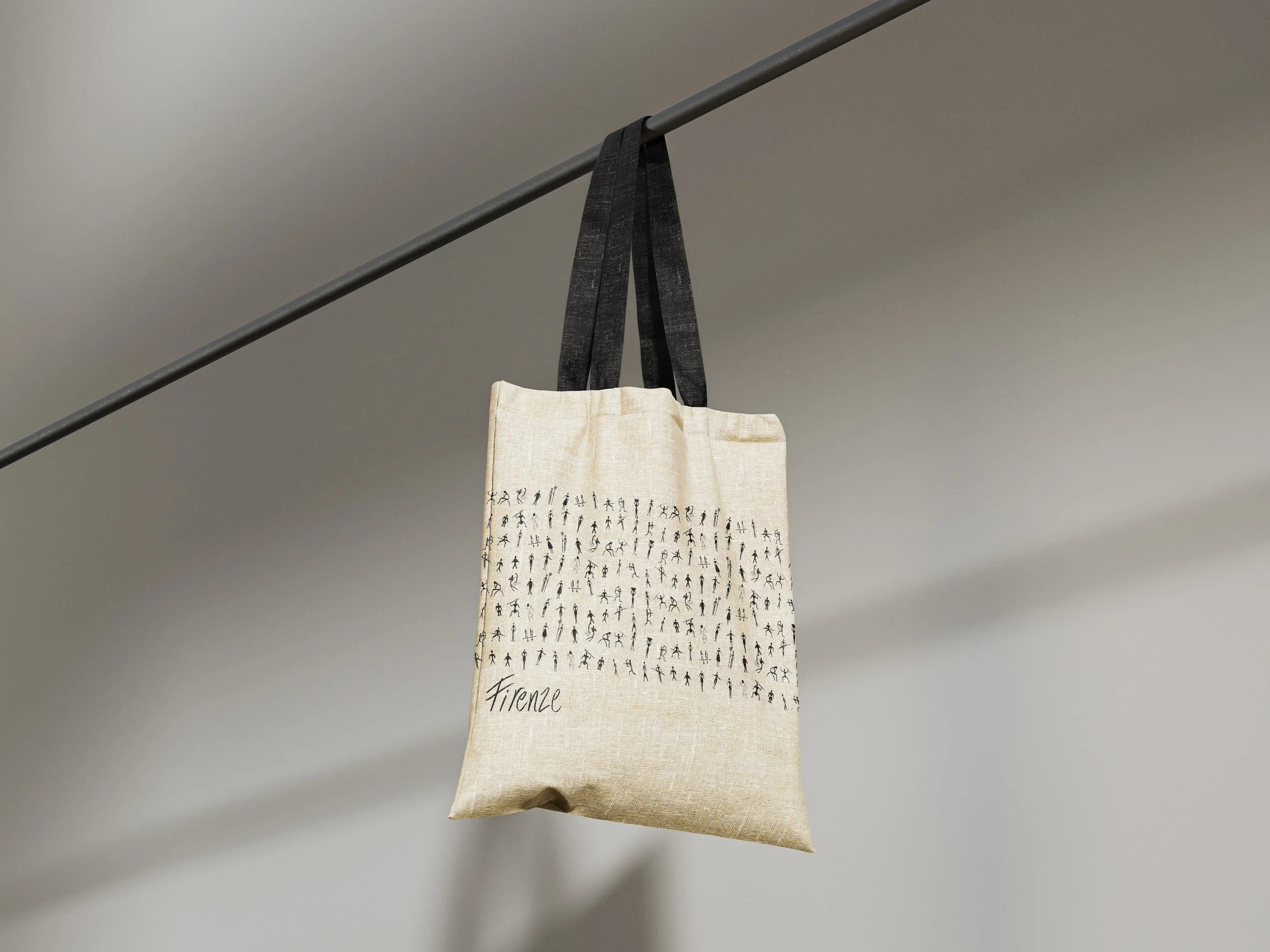
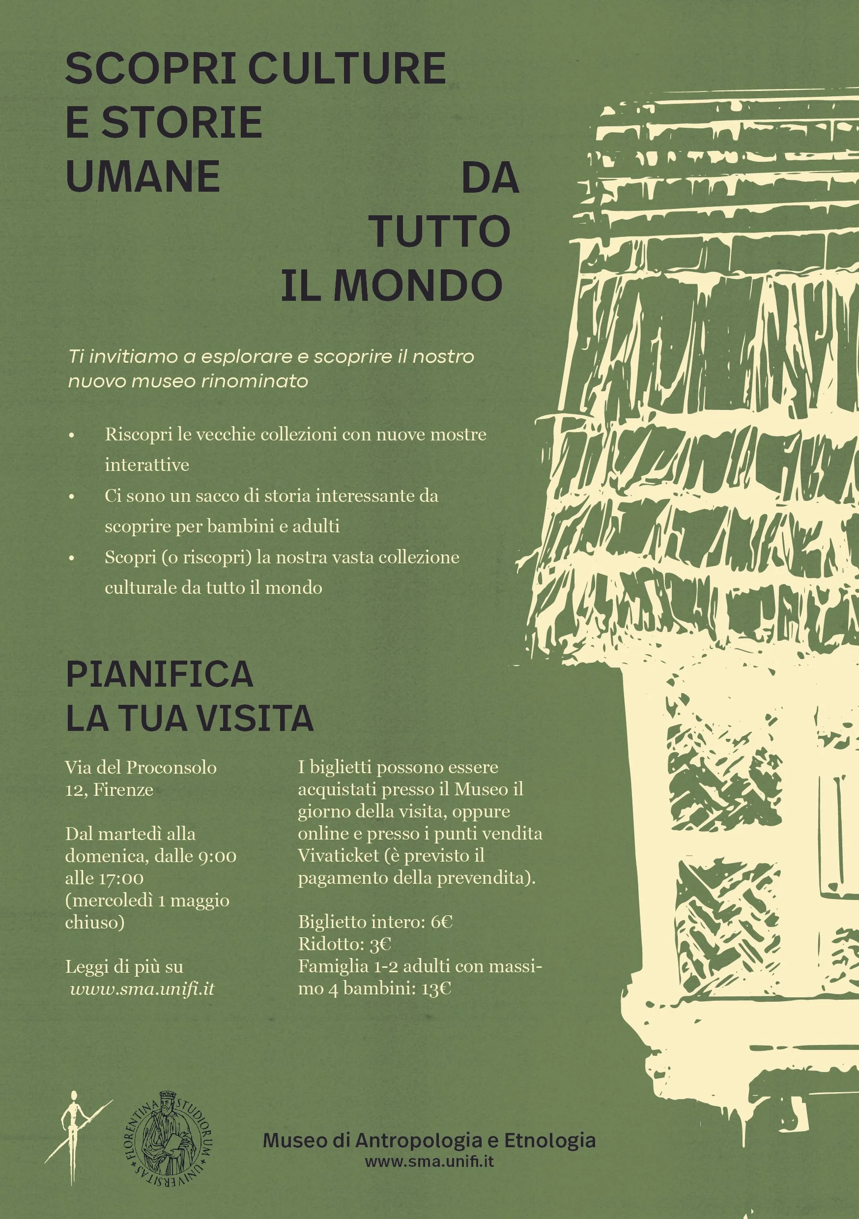
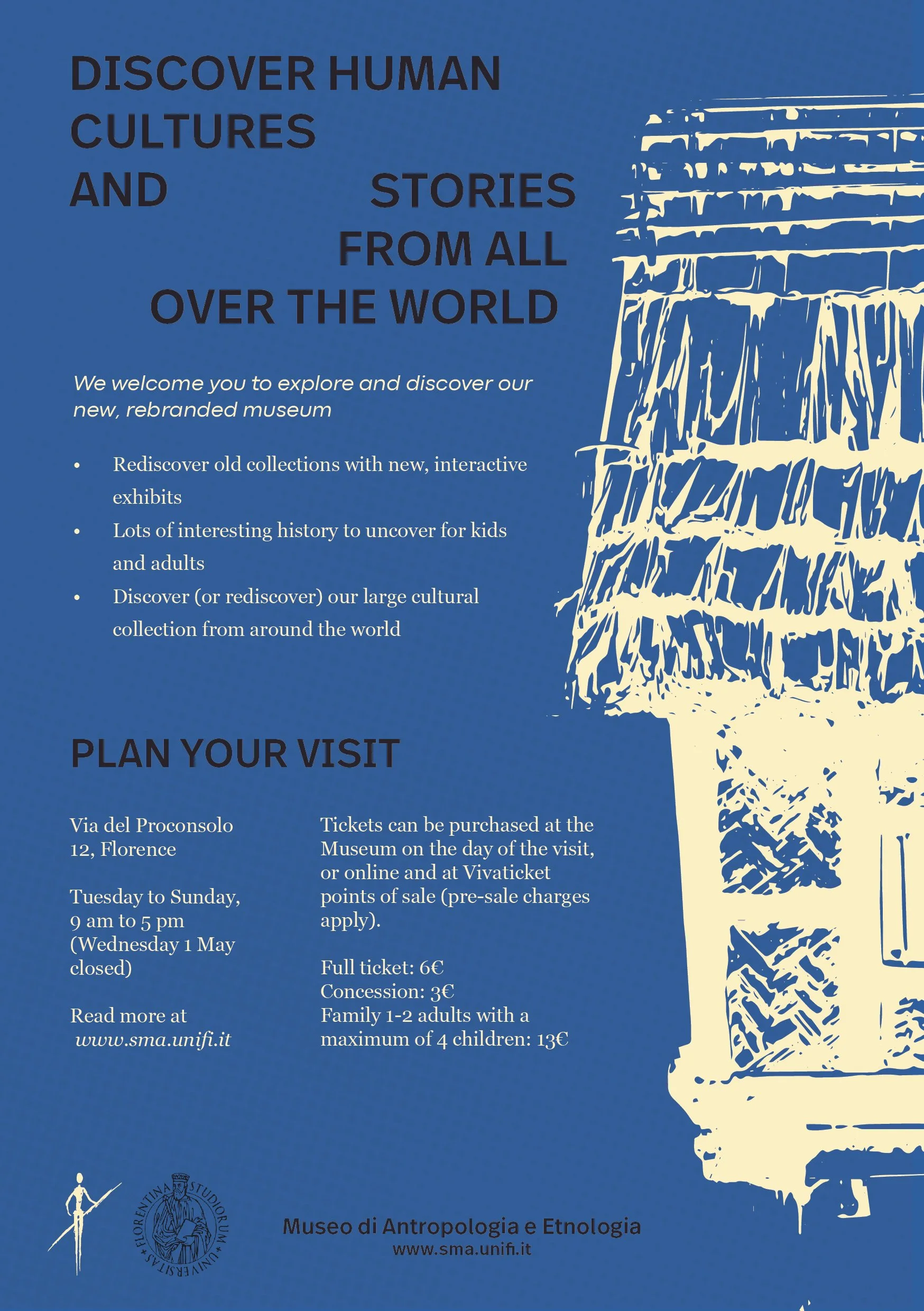
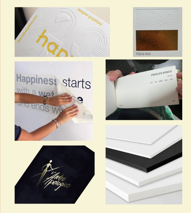
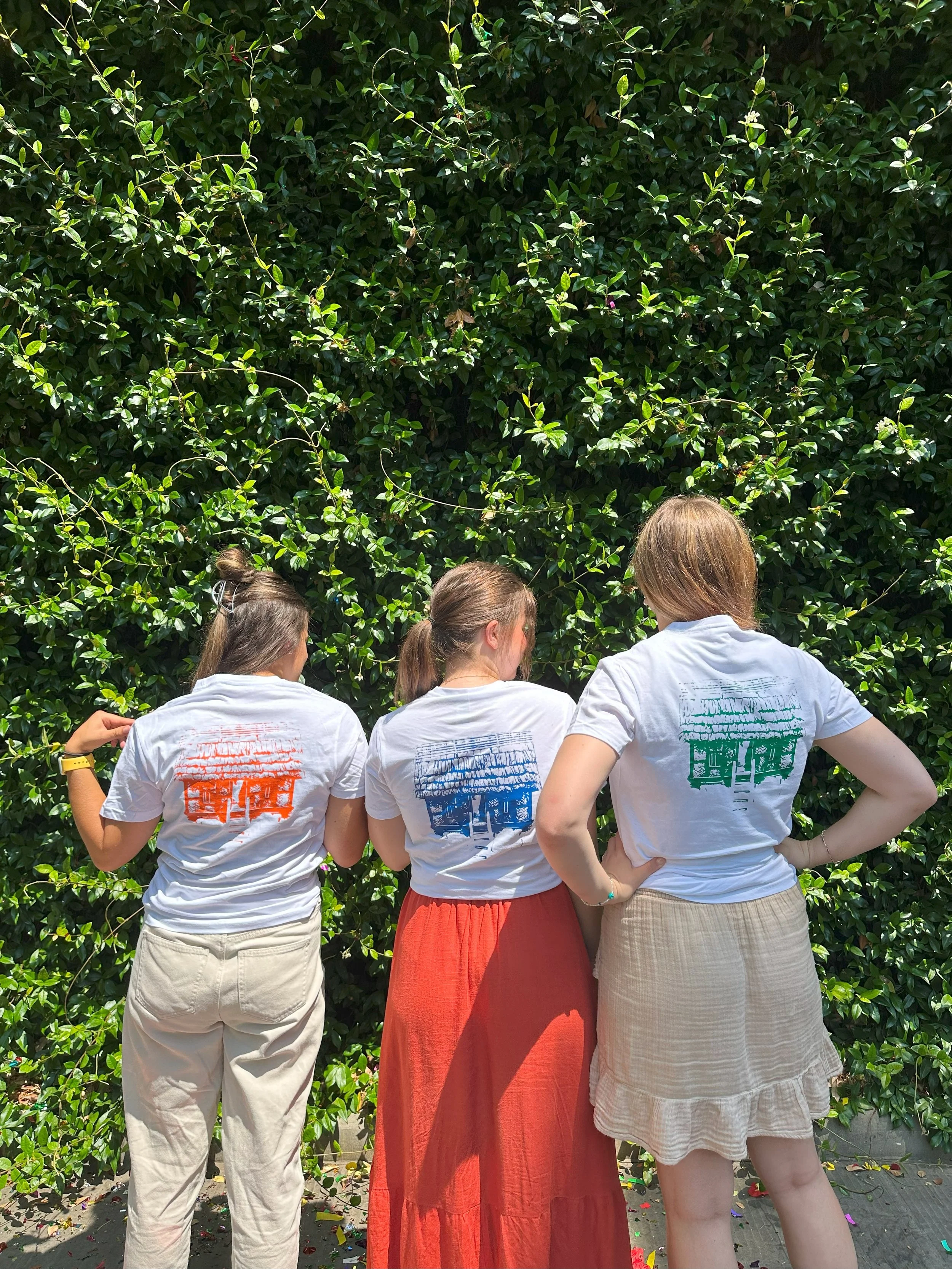
New designs for posters, advertisements, business cards and more
Mock ups and printed t-shirts of our designs to see the vison come to life
Presentation of our work that we presented at IED, and was sent to the museum for consideration
Here, I got to further refine my skills in Adobe, as well as working on designing and creating alot of content in a short amount of time. We also got a lot of support and good advice for the lecturers at IED with the software, museum design and overall assistance on making a unified, good vision for the museum.
Gallery - Final worK🙌✨